![Final Programme 1]()
The Final Programme (1973) is a film I must admit I have been desperate to see for many years. Ever since I read that Ossie Clark and John Bates designed clothes for the leading man and lady respectively, but also because of the connection to The Avengers – courtesy of writer, designer and director, Robert Fuest. I am less familiar with the work of Michael Moorcock, so I hope that his fervent fans will forgive me for any ignorance and allow me to mainly rave about the aesthetics of the film.
![final programme 20]()
It is a fascinating attempt to look at a future, distant or not – we are never entirely sure, without trying to be futuristic. In design terms, this is approached with an eye towards the Art Deco; which, possibly without realising, actually firmly establishes it as quite thoroughly Seventies in style. The designers chosen, Clark and Bates, are also notorious for their period tendencies, and the set designs are reminiscent of plenty of Vogue interiors features I have seen from the time. But, much like A Clockwork Orange, with a bit of distance (and when, like me, you think something looking ‘a bit Seventies’ can never possibly be a bad thing), this subtle Seventies-does-Thirties version of the future actually works perfectly. While the technology is a tad clunky, it is so highly stylised that you can actually believe that we might return to it someday.
![Final Programme 9]()
Dressed in Ossie Clark-designed Tommy Nutter-made suits, Finch swaggers around like an elegant hybrid of Ossie himself, Marc Bolan and Jim Morrison. Bouncy curls, sultry lips and just the right amount of chest hair on show. Laconic, cool, and admirably fond of biscuits, he is a perfect off-beat hero. It’s no wonder Jon Finch was considered for the part of James Bond, but it’s also no wonder that he turned it down. Jerry Cornelius is a far more interesting character to play; the humour is quirky and the fight scenes are playful – his movements more catlike. Bond is a thuggish oaf in comparison.
![Final Programme 3]()
Jon Finch in The Final Programme
Cornelius is the ultimate Man in Black, slim and sleek. From the beginning, aside from an all-too-brief moment in a kaftan, he really only wears a sharply tailored black suit with a gently ruffled white silk shirt underneath. We first see him with a large fur coat over the top, which again is rather more reminiscent of a rock star than of a ‘hero’ – futuristic or otherwise, and a pair of simple aviator sunglasses. If there are subtle variations in his black suit, they are not made to be noticeable. But it also doesn’t feel like a rigid costume, just a signature choice. In a way, Clark has the harder task in designing a single ‘look’ which must run through and work within the design feel of the entire film: from the wilds of Finland, through his family’s perfectly minimalist Art Deco house and then to rural Turkey.
It is interesting to note that Ossie stated, in an interview from April 1969, that he was originally asked to do costumes for 2001: A Space Odyssey. The collaboration came to nothing, however, thanks to ‘disagreements’ between Clark and (presumably) Kubrick.
“I gave it up partly because the film company didn’t like my ideas, and didn’t think I knew what I was talking about.”
Ossie Clark, 19 Magazine April 1969
![Final Programme 2]()
Of course Hardy Amies ultimately became the designer for 2001: A Space Odyssey, and it reinvigorated his career during a time when the likes of Ossie and John Bates were far more in demand. I see this as interesting, because this ‘futuristic’ film doesn’t attempt space age futurism in the way 2001: A Space Odyssey did. It does make you wonder if Ossie had decided that his brand of period-influenced design and quirky tailoring was the only way he wanted to design 2001: A Space Odyssey, and that – coincidentally – it was very much in keeping with the overall design by Fuest for The Final Programme.
![Final Programme 6]()
Julie Ege in The Final Programme
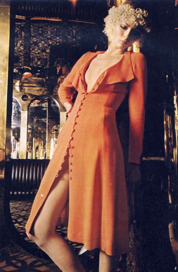
Jenny Runacre (below) is the lucky lady with the impossibly elegant (and predominantly white) couture John Bates wardrobe. Her ‘look’ is strikingly unusual for the time, and a perfect contrast to the brief appearance by Julie Ege (above), who is the perfect early Seventies dolly we see in a Mr Freedom, Pop Art-inspired sequence, and later to Sandra Dickinson’s kitschy, bottle blonde waitress. Runacre looks like a kind of hard bitch version of a Botticelli muse; big eyes and softly curled hair flat around her face, but with a gorgeously sneering voice and a cool air of superiority.
![Final Programme 17]()
Jenny Runacre in The Final Programme
John Bates gets to have a lot more fun with his anti-heroine, who has considerably more costume changes than Finch, with a largely white palette and subtle variations on his billowing batwing shapes of the time. With boots by Richard Smith for The Chelsea Cobbler, and furs by Austin Garritt (with whom Bates often seems to have collaborated on leather, suede and fur designs at the time), her look is flawless from head to toe. The use of white feels like a conscious aspiration on her part, heavily connected to her vision for the future of humanity. But it also contrasts in a very basic way with the head-to-toe black of Cornelius; like a reverse of the black and white, evil and good, yin and yang cliché.
![Final Programme 14]()
Jenny Runacre and Jon Finch in The Final Programme
It is interesting to contrast Bates’s designs for Miss Brunner with his more famous costume design stint for another strong female character: Emma Peel in The Avengers. Where Emma Peel’s clothes were feline, often cut sparingly and close to the body, Miss Brunner’s are billowing, voluminous and with more feminine detailing in trims and embroidery. Leather is replaced by suede, long-haired sheepskins replace rabbit fur in bold op-art patterns. Prevailing trends of the early Seventies, and a clear design direction by the two designers, mean that the roles are somewhat reversed; where the male protagonist is wearing skin-tight tailoring and revealing flashes of skin, the female is largely concealed until the denouement.
![Final Programme 19]()
Jenny Runacre in The Final Programme
While there is no specific designer credited with the costumes of the more minor characters, the overall costume consultant – I was delighted to note – was one Marit Lieberson. Better known as Marit Allen (formerly of British Vogue and one of the most influential fashion journalists of the 1960s) Allen championed both John Bates and Ossie Clark early in their careers – wearing a design by the former for her wedding to Sandy Lieberson (also producer of this film) in 1966 – so the decision to use them so prominently in the film makes the most perfect sense.
It somehow feels like the combination of Fuest as production designer, Marit as costume consultant and two of the best British designers of the time, was a combination that couldn’t possibly lose. And yet, it did.
![Final Programme 16]()
Despite the fact that The Final Programme has become something of a ‘lost’ film of the otherwise booming British film industry at the time, the overwhelmingly harmonious styling has secured it, for me, as one of the finest films of that period. I don’t see why A Clockwork Orange or Logan’s Run (both films of a very similar aesthetic and calibre) should both be so well-known, while this languishes in obscurity.
![Final Programme 5]()
![Final Programme 4]()
![Final Programme 7]()
![Final Programme 8]()
![Final Programme 10]()
![Final Programme 11]()
Jon Finch and Sandra Dickinson
![Final Programme 12]()
![Final Programme 13]()
![Final Programme 15]()
![Final Programme 18]()
Filed under:
1970s,
Austin Garritt,
british boutique movement,
chelsea cobbler,
jean varon,
Jenny Runacre,
john bates,
Jon Finch,
Julie Ege,
marit allen,
ossie clark,
Robert Fuest,
Sandy Lieberson,
The Final Programme,
Tommy Nutter,
Vogue ![]()
![]()